Sleep or Die / Independent spec concept
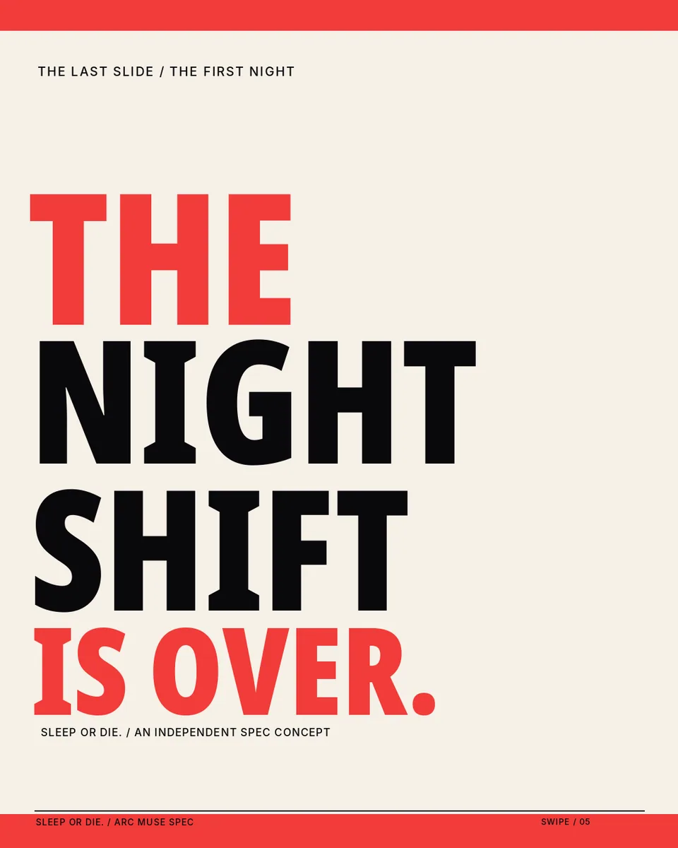
The Night Shift Is Over
A striking nighttime identity without the usual wellness clichés.
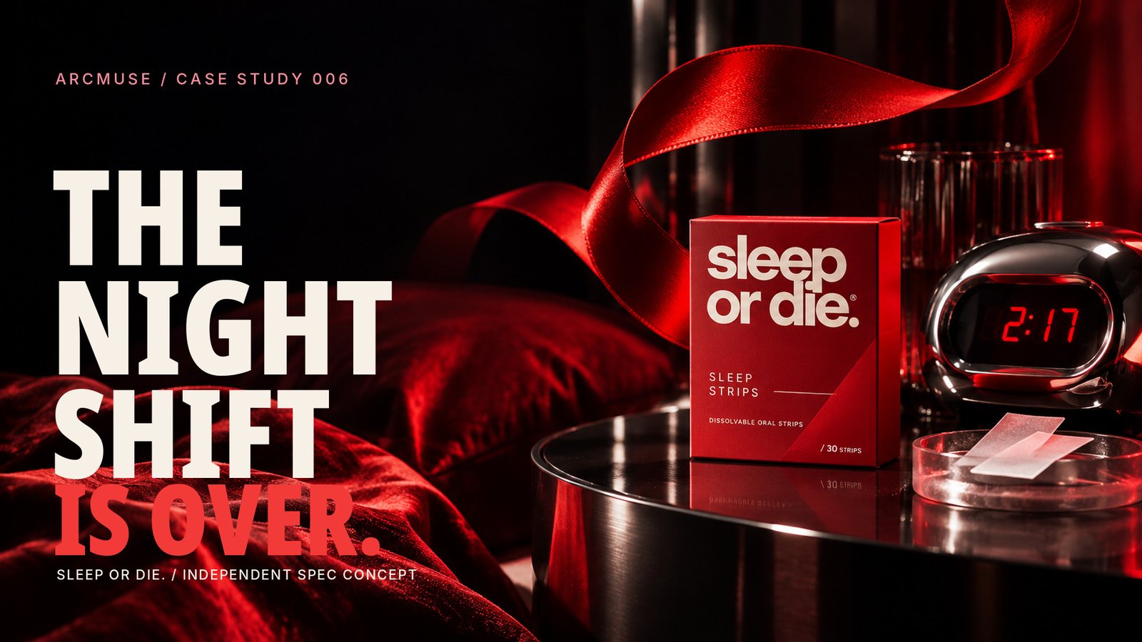
Independent, unofficial spec concept from my creative practice at ArcMuse. Not commissioned, approved, sponsored, or endorsed by the featured brand. AI-assisted product imagery is illustrative; no campaign performance is claimed.
The starting point
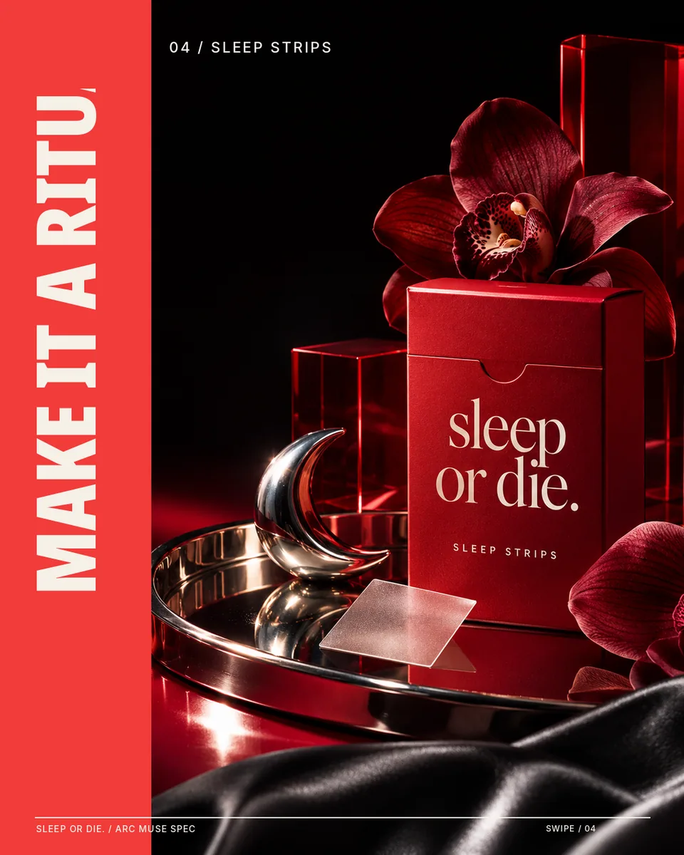
The starting question was how sleep-wellness content could look more like a provocative fashion editorial than another pastel bedtime ad. The name Sleep or Die and its Sleep Strips product category made the contrast feel natural for this independent concept.
The creative challenge
Be dramatic, memorable, and product-relevant without creating fear-based messaging or implying guaranteed sleep or medical outcomes.
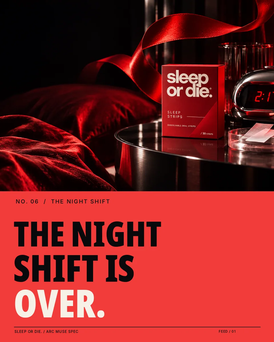
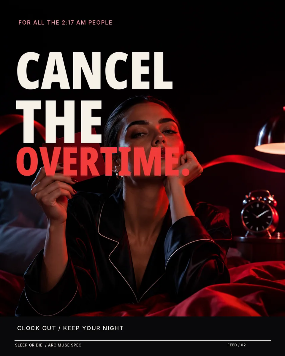
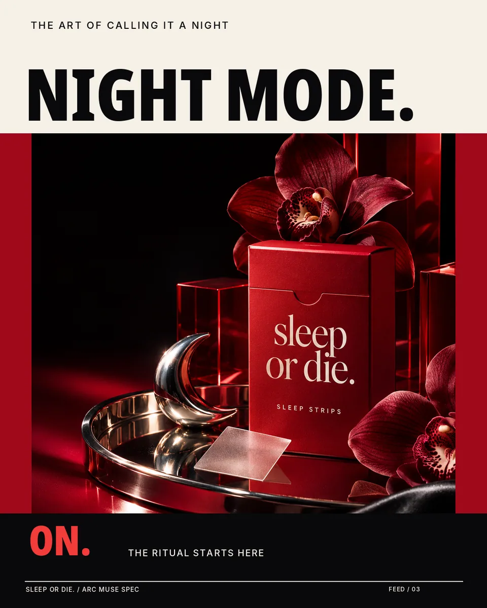
Three feed graphics
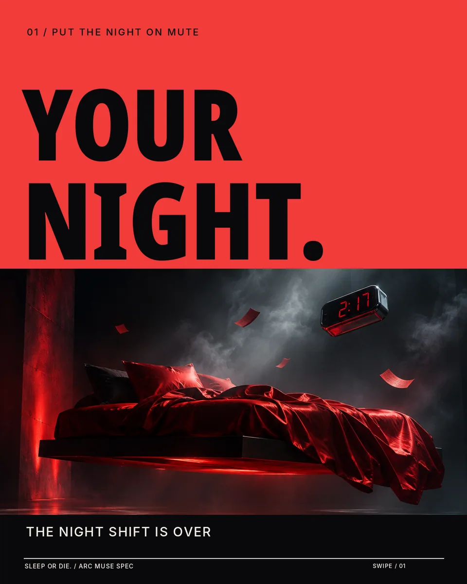
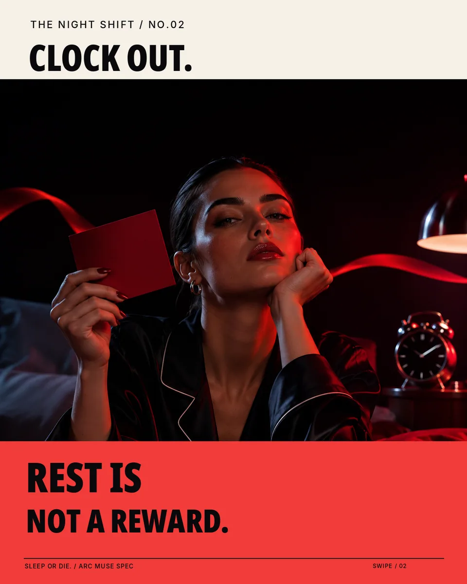
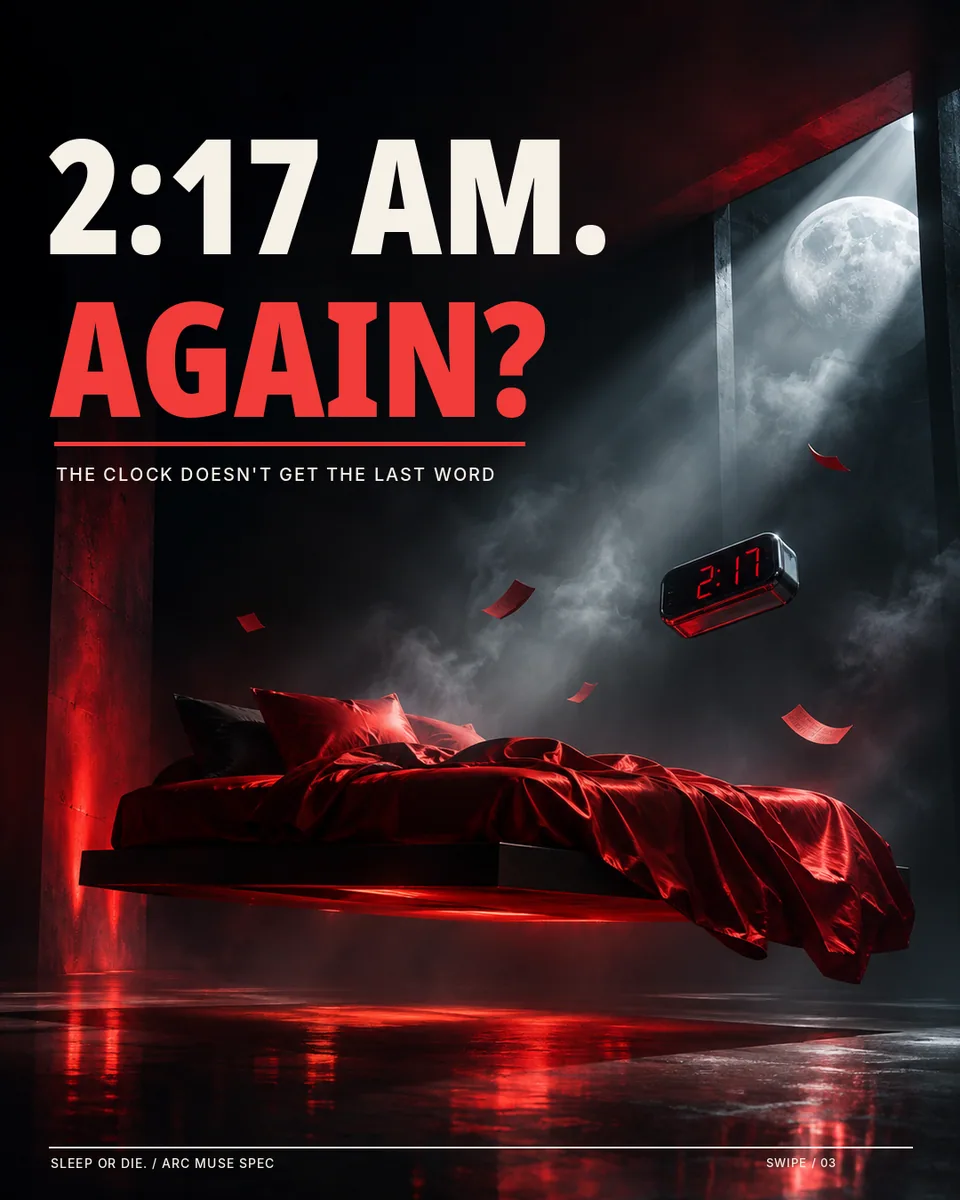
A five-slide story
Swipe, scroll, or use the arrow keys and buttons to explore in order.
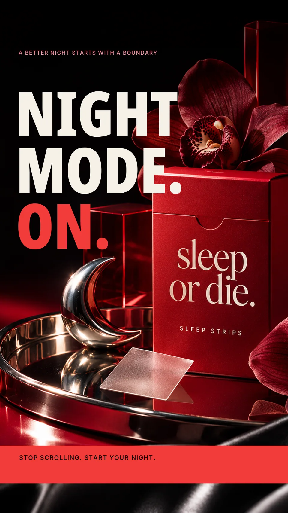
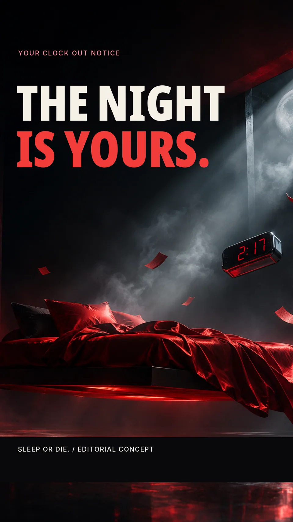
Two vertical Stories
My approach
“The Night Shift Is Over” uses nearly black compositions, crimson satin, chrome objects, and a recurring 2:17 AM clock. The art direction borrows the suspense of midnight cinematography, but the message stays focused on a stylized evening routine rather than a medical promise.
The making of
I assembled AI-assisted product still lifes, a red-lit fashion portrait, and a surreal levitating bedroom scene. These anchor three feed graphics, five editorial carousel frames, and two vertical Stories. The motion brief outlines a clock cut, floating-object transition, light sweep, and final packshot; no finished video is represented as existing.
Deliverables & takeaway
The study tests how much tension and personality a wellness brand can carry while keeping its social design coherent and responsible.
3 feed graphics · 5 carousel slides · 2 Stories. Finished static artwork. Any motion treatments are planning references, not completed videos.